
$
$
Product successfully added to your shopping cart.
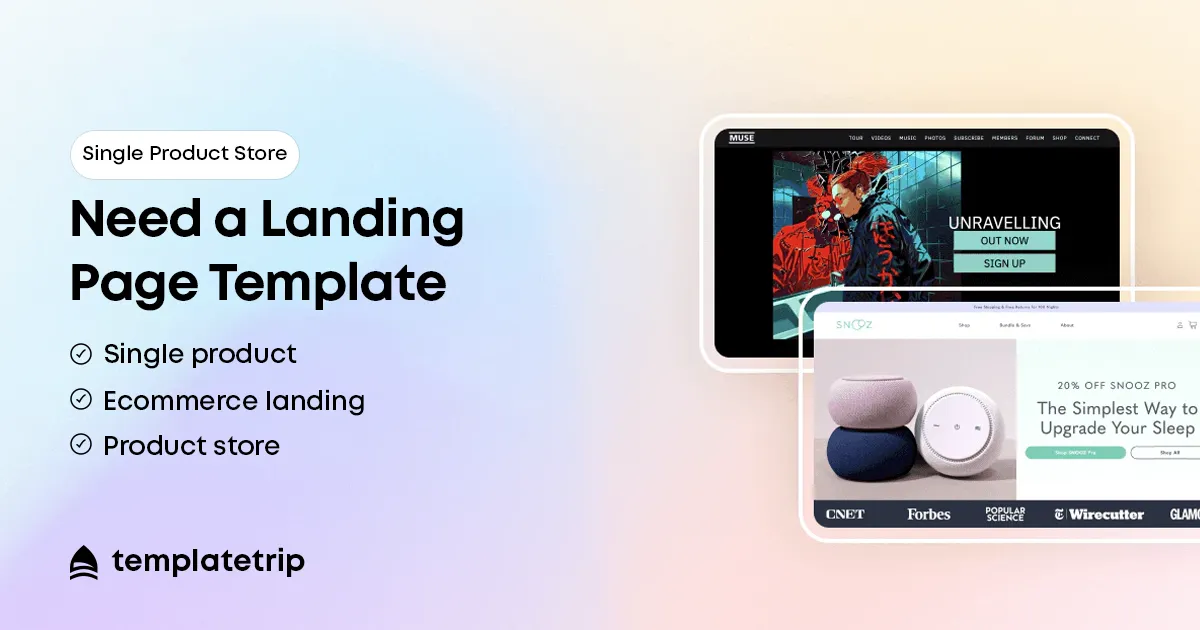
There is a category of ecommerce business where conventional template advice simply does not apply: the single product store. A business built around one hero product operates on fundamentally different logic than a catalogue store. Yet the most common mistake single product store owners make is choosing a multipurpose theme and wondering why their conversion rate is disappointing. A catalogue theme is built for browsing. A landing page template is built for converting. For a single product business, the distinction is everything.
A multipurpose theme assumes the visitor is browsing. The homepage shows featured collections. There is a product grid. There are category pages. Every design element is oriented toward helping the visitor find something in a large inventory. For a single product store, this creates an immediate problem: there is nothing to discover. The visitor is confronted with a visual language of browsing when what you need is a language of buying.
A landing page template makes a different assumption: the visitor has intent. They clicked an ad, followed a social post, or searched for your category. Your job is not to help them find something — it is to persuade them that what they are already looking at is worth buying. Every section — hero, benefits, social proof, objection handling, FAQ, guarantee, CTA — is architected to build the case for one action: Add to Cart.
The first thing a visitor sees: the product dramatically photographed or filmed, the core benefit statement, and a high-contrast CTA. Not a navigation menu with 12 items. Not a featured collections grid. The product and the reason to buy it, immediately. Answering the visitor's first question — "What is this and why should I care?" — in under five seconds.
A landing page template moves through the product's benefits sequentially, building the case for purchase. Full-width image and benefit statement. Video demonstrating the product in use. Problem/solution framing. Each section serves the persuasion arc — completely different from the neutral product page format of a catalogue theme.
In a catalogue theme, reviews live in a tab at the bottom of the product page. In a landing page template, social proof is distributed throughout: a trust bar near the hero, a featured review after the benefits section, a UGC gallery in the middle, a review summary before the final CTA. Repetition of trust signals continuously reinforces the buying decision at every point a visitor might hesitate.
Dedicated sections for questions that stop purchases: a FAQ section, a comparison section (how is this different from alternatives?), a returns/guarantee section, and often a "Is this right for me?" section. These elements — placed strategically through the page — reduce hesitation and increase conversion.
A landing page template does not rely on a single Add to Cart button. It places CTAs after the hero, after the benefits section, after social proof, and after the FAQ — because different visitors are convinced at different points in the scroll journey. The visitor sold by the hero should not have to scroll to the bottom to convert.
The paradox of choice — giving people too many options reduces their likelihood of choosing any of them. A catalogue theme asks the visitor to make many micro-decisions throughout their visit. A landing page template removes that cognitive load: one product, one decision, one action. The entire design environment is calibrated to make that one action feel obvious, safe, and desirable.
Removing distraction is as powerful as adding persuasion. For single product businesses, focus is a conversion multiplier.
Single product stores are often built around a strong product-market fit with a specific audience: a skincare product for sensitive skin, a protein supplement for strength athletes, a travel accessory for frequent flyers. The landing page format allows the entire page to be written directly to that audience — their language, their objections, their aspirations. A catalogue theme's generic architecture makes this deep audience focus difficult. The landing page template is purpose-built for it.
Template selection tip: When selecting a single product landing page template, prioritise those with flexible benefit section layouts, prominent video embed support, built-in countdown timer options, and sticky header CTA bars for mobile. These elements consistently lift conversion for single product stores.
Single product stores often rely heavily on paid social advertising (Meta, Instagram, Google). Landing page templates are built for this traffic pattern. A visitor from a specific ad has specific intent. A landing page template that mirrors the ad's message — matching the ad's hook to the page's hero headline — converts paid traffic at significantly higher rates than a generic catalogue page.
Catalogue themes convert paid traffic at 1–2%. Well-designed single product landing page templates regularly achieve 3–5% or higher on cold traffic. For every rupee or dollar spent on advertising, the conversion rate of the landing page determines the ROI.
If you are building a single product store, your template choice is one of the most consequential decisions you will make. A multipurpose catalogue theme gives you a store that looks like a store — it does not give you a conversion machine for a product you have invested everything in building. A landing page template is designed from the ground up to do one thing: persuade the right visitor to buy your specific product. For single product businesses, the landing page template is not just a design choice — it is a business decision. Choose focus. Choose persuasion. Choose the template built to sell what you are selling.
single product store template, landing page ecommerce template, one product store design, single product shopify theme, product landing page template, single product woocommerce theme, ecommerce landing page design, convert single product store, small sku ecommerce store